Axiom Clinical Performance Measures
Axiom Decision Support with Clinical Performance Measures (CPM) helps organizations establish a comprehensive view of service line performance across financial and clinical performance measures. Reports and analytics facilitate the conversation between finance and clinical process improvement teams, highlighting opportunities where quality and cost outcomes could be improved. CPM provides an executive inpatient dashboard and multiple supporting reports.
NOTE: The Clinical Performance Measures features are only accessible if your organization has a license for Axiom CPM.
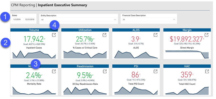
Inpatient Executive Summary dashboard
This dashboard displays KPI views of clinical and financial data to help inform and drive decision making for executives.
- Slicers - Allows for filtering of all KPI cards and area charts in the dashboard.
- KPI cards - Indicates health in that area, including goal set in the previous year.
- Area charts - Provides additional details regarding trend on the KPI card.
- Open report - Provides a link to open and view the source report for the KPI card to review more details.
For more information and instructions, see Inpatient Executive Summary dashboard.
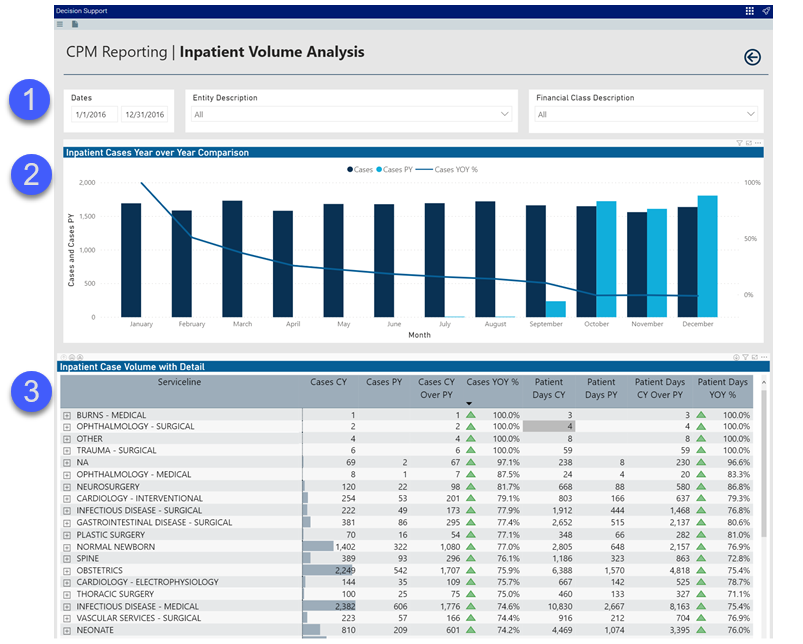
Inpatient Volume Analysis report
This report provides volume trends and details for inpatient cases.
- Slicers - Allows for filtering of visualizations within the report.
- Bar and line chart - Provides a line and clustered column chart that displays current year and prior year case volumes by month. The line indicates year over year percentage change in volume.
-
Table - Displays a matrix visualization that includes drill path set from service line to MSDRG to admitting provider. This visualization compares current year and prior year case volume and patient day volume.
For more information and instructions, see Inpatient Volume Analysis report.
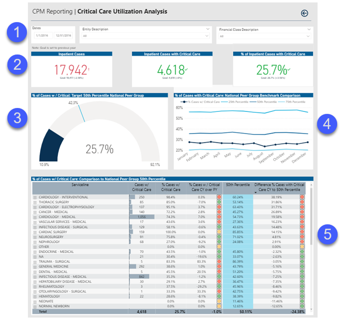
Critical Care Utilization Analysis report
This report provides benchmarking data regarding inpatient cases that required critical care.
- Slicers - Allows for filtering of the visualizations within the report.
- KPI cards - Indicates health in that area, including goal set in the previous year.
- Gauge chart - Shows the measure values that target the 50th percentile benchmark. The minimum value is set to the 95th percentile benchmark and the maximum is set to the 5th percentile.
- Line chart - Illustrates measure by month compared to benchmarks.
-
Table - Displays a matrix visualization with a service line to MSDRG drill path that compares measure value for current year and prior year as well as the 50th percentile benchmark.
For more information and instructions, see Critical Care Utilization Analysis report.
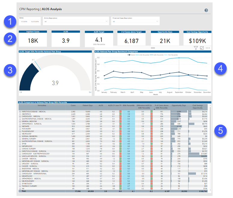
ALOS Analysis report
This report provides benchmarking data regarding the Average Length of Stay for your organization.
- Slicers - Allows for filtering of visualizations within the report.
- KPI cards - Indicates health in that area, including goal set in the previous year.
- Gauge chart - Shows measure values that target the 50th percentile benchmark. The minimum value is set to 95th percentile benchmark and the maximum is set to 5th percentile.
- Line chart - Illustrates measure by month compared to benchmarks.
-
Table - Displays a matrix visualization with service line to MSDRG drill path that compares measure value current year and previous year as well as the 50th percentile benchmark. This matrix also includes an opportunity days and cost savings opportunity metric.
For more information and instructions, see ALOS Analysis report.
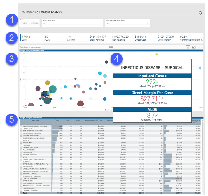
Margin Analysis report
This report provides regarding details regarding margin analysis across service lines.
- Slicers - Allows for filtering of all the visualizations within the report.
- KPI cards - Indicates health in that area, including goal set in the previous year.
- Scatter chart - Displays ALOS on Y axis and Direct Margin per Case on X axis. The circles represent case volume for specific service lines.
- Tool tip - Shows KPIs related to cases compared to previous year, direct margin per case compared to previous year, and ALOS compared to previous year.
-
Table - Displays a matrix visualization with service line to MSDRG drill path that shows relevant profitability metrics.
For more information and instructions, see Margin Analysis report.
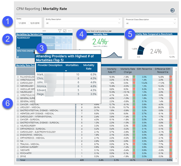
Mortality Analysis report
This report provides KPI metrics and details regarding mortality rates at your organization and across service lines.
- Slicers - Allows for filtering of visualizations within the report.
- Tree map visualization - Shows the number of mortalities by service line.
- Tool tip - Shows a matrix of attending providers with the top five highest number of mortalities.
- KPI card - Shows KPIs related to mortality rate compared to the previous year.
- Gauge chart - Shows measure values that target the 50th percentile benchmark. The minimum value is set to 95th percentile benchmark and maximum is set to 5th percentile.
- Table - Displays a matrix visualization with service line to drill path that compares measure value current year and prior year as well as the 50th percentile benchmark.
For more information and instructions, see Mortality Analysis report.
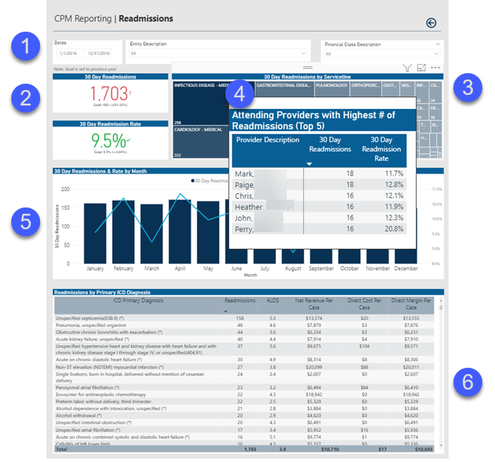
Readmission Analysis report
This report provides KPI metrics and details regarding readmission rates at your organization and across service lines.
- Slicers - Allows for filtering of all the visualizations within the report.
- KPI card - Indicates health in that area, including goal set in the previous year.
- Tree map visualization - Shows the number of 30-day readmissions by service line.
- Tool tip - Shows a matrix of attending providers with top five highest number of 30-day readmissions.
- Bar and line chart - Displays 30-day readmissions by month and the line representing monthly readmission rate.
-
Table - Matrix visualization with the primary diagnosis of the readmission with other pertinent metrics.
For more information and instructions, see Readmission Analysis report.
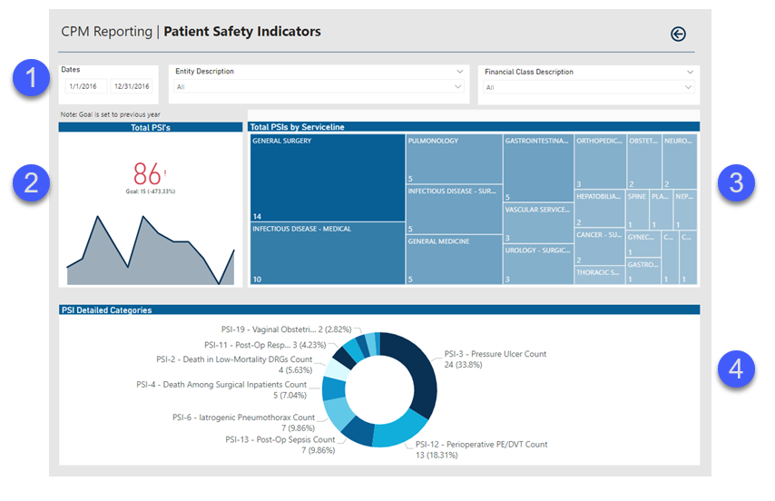
Patient Safety Indicator (PSI) Analysis report
This report provides metrics and details regarding PSI at your organization and across service lines.
- Slicers - Allows for filtering of all the visualizations within the report.
- KPI card - Indicates health in that area, including goal set in the previous year.
- Tree map visualization - Shows the number of PSIs by service line.
- Donut chart - Displays the number and percentage of PSI types.
For more information and instructions, see Patient Safety Indicator (PSI) Analysis report.
Hospital Acquired Condition (HAC) Analysis report
This report provides metrics and details regarding HAC at your organization and across service lines.
- Slicers - Allows for filtering of all the visualizations within the report.
- KPI card - Indicates health in that area, including goal set in the previous year.
- Bar and line chart - Displays HACs by month and the line representing HAC rate by month.
- Donut chart - Displays the number and percentage of HAC types.
- Tree map visualization - Shows the number of HACs by service line.
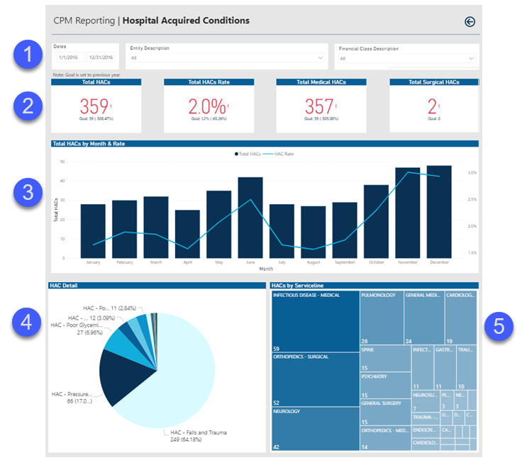
For more information and instructions, see Hospital Acquired Condition (HAC) Analysis report.
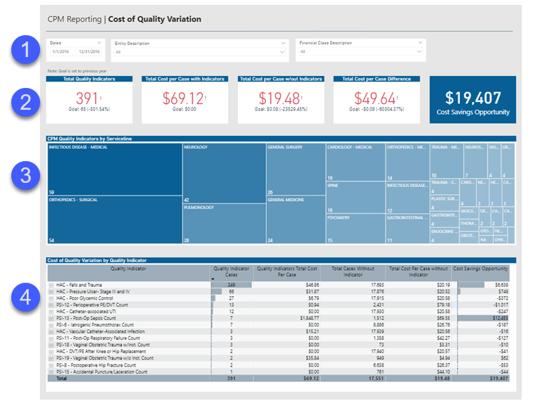
Cost of Quality Variation report
This report provides KPI measurements and other details related to determining potential cost savings opportunities.
- Slicers - Allows for filtering of all the visualizations within the report.
- KPI Card - Indicates health in that area, including goal set in the previous year.
- Tree map visualization - Shows the number of Quality Indicators by service line.
- Table - Shows a matrix visualization with Quality Indicator to MSDRG to attending provider drill path that compares the cost of cases with and without the indicator present and provides a cost savings opportunity projection if these cases no longer had the quality incident.
For more information and instructions, see Cost of Quality Variation report.
